Thursday, February 20, 2014

Doodling, Lettering & Just Playing Around

I am trying to draw and paint more, it is true.  But I had been trying to make every picture I do a perfect finished product.  I was not spending any time just doodling or screwing around or trying something outside my comfort zone (and possibly failing).  Below are some examples of me just playing around in various medium.

Believe it or not, only two colors were used for this:  pthalo blue and burnt umber.  I do not mix colors well and it is something I am working on.  I saw another artist do a wonderful snow scene using those two colors and I knew I had to try it.  I think the colors on the mountain are quite stunning. I overworked the sky too much but that is okay.


Once upon I was quite the accomplished letterer and calligrapher.  I created wedding invites and seat placement cards.  Alas, my skills have atrophied considerably since high school (as can be seen above).  With the advent of new, high quality yet inexpensive calligraphy pens, I am looking forward to sharpening my skills.  Plus it is fun.

I filled the bottom of this practice sheet with a little line work using two different weight faber-castell markers (XS and S).  Then I decided to play around with watercolor and grey marker.  I like the figure and his stance (how he is shifting his weight on one leg) and I like the line work on the rocks he is standing on as well as the distant mountain. Not sure if the color adds anything, but that was not the point, the point was just to be creative.  

This doodle was done with several different brown/sepia inks, everything from marker to Winsor & Newton peat brown ink with a speed ball nib and even a little conte crayon for good measure.  As has been abundantly clear, I love brown/sepia inks.  This was just me playing with a bunch of tools that I have acquired over the last decade.

Below is some details of the page. I like the variety of lines that can be achieved with a dip pen or brush.


Saturday, February 15, 2014

Half a Moose

The reference photo I used was cropped and only showed half of the moose.  Rather than fill the caboose of the moose myself, I decided to leave half a moose.  It gives it a weird, ethereal vibe that I quite like, especially with the light washes.

As with the backyard tree, I used a simple color palette of browns (raw sienna, burnt umbar and van dyke brown) but added a splash of green for contrast and pop.

                 Pen & ink and watercolor on 246 lbs acrylic linen paper 9x12

Here is the initial sketch using winsor & newton peat brown ink and kuretake comic pen nib G model.  Lately, I have been using a variety of markers to draw as they are convenient and portable.  I forgot how wonderful it is to draw with a dip pen and nibs.  You cannot produce the variety of weighted lines with a marker that you can with a nib.  Much of line work is obscured by the watercolor washes, but that is okay.  It was still fun to do them.
 

Sunday, February 09, 2014

To Make an End is to Make a Beginning -- The Return of Pastels

Pastel painting is my true passion.  While I am enjoying watercolor immensely, working in pastels is where I feel most expressive.  Hard to believe it has been nearly a decade since I have painted a landscape in pastels and 2 years since this.

This is another Key West sunset, taken while on a Wine and Wind sailing tour.  It was a great time and a perfect end to a wonderful day.  I had debated about trying this sky in watercolor, but ultimately I felt I could do it more justice in pastels.  Plus, my beautiful Unison pastels have sat neglected long enough.

What we call the beginning is often the end
And to make an end is to make a beginning.
The end is where we start from.
TS Eliot
Little Gidding

                                     Pastel on paper mounted on board 16x20


The room set up and photo reference.  Since I have flattened my high school easel for my watercolor work, I am using a table top easel for the pastels.  I like this new set up as it allows me to paint in watercolor or pastels, without wasting time finding my tools.  If you look closely, you will notice the sky in the photo is different from the final, I felt the color gradation was too jarring and needed to be softened.

 A detailed close up of the setting sun. I blended some of the colors in the clouds to give them a more atmospheric look while left the strokes in the water rougher to show motion.  Notice how the grain of the pastel paper peaks thru in some areas, but not in others.

Thursday, February 06, 2014

The Road Less Traveled By

Outside my window, beyond the tree and stockade fence is a protected wooded area that will never be built on or developed.  It is a little piece of sylvan space in our urban sprawl, and I love to peer at it from my perch in the art room. It always inspires me and makes me smile.

In the course of the last few weeks, I have been going through the accumulated wealth of art supplies that I have purchased in the past decades, from as far back as high school to now.  One of the treasures that I found was my Ames Lettering Guide from back in the day when we did not have fancy-smancy computer fonts and I hand drew calligraphy.  And since the view outside my window always makes me think of Robert Frost's famous poem, I decided to add the first and last two lines of the poem to this sketch using the lettering guide.  It was much fun.

                                  Pen and Ink, Watercolor on paper 10x7


Saturday, February 01, 2014

Tiger, Tiger


TIGER, tiger, burning bright
In the forests of the night,
What immortal hand or eye
Could frame thy fearful symmetry?
The Tiger
William Blake

I bought a bunch of new paints, including several different greens (yes, I know, if I was better at mixing colors, I would not need so many greens. . .but new paints are cool) and I have had a photo of a tiger for years. It was the perfect excuse to use the new greens.

I love drawing big cats and tigers most of all, but this is the first time I have painted one.  It came out a bit more "cartoony" then I wanted (his face is a bit too long, more like a lion's), but I can see several technical improvements in my painting from even a year ago.  I like how the colors are layered on top of each other (wet-on-dry) and the brush work on the stripes.  It has truly been a long time since I drew directly with a brush.

Watercolor on 140lbs watercolor block 9x12

Sunday, January 26, 2014

Sailing off Sun Set Key

This piece kinda got away from me.  While in the keys, I took several photos of beautiful sunsets, some with deep oranges and yellow, some with soft pinks and reds, all with the intent of using them as the basis for studio pieces.  This is the first such painting.  

I wanted to add a bit more color to the water and may have overdone it a bit.  Not sure, I go back and forth as to whether I like this or not. You all can decide. I am pleased, however, with how the sail boat turned out. 

This is one of my larger watercolors at 12x16 as I am feeling more confident working bigger. 

                    Watercolor on 140lbs watercolor block 12x16 

Monday, January 20, 2014

Simple Sketch -- Backyard Tree

For the first time in a long, long time, yesterday morning I did a simple sketch upon waking.  It is part of plan to get back to basics and remember the simple, yet critically important things.  Things that are easy to forget.  Things that are easy to overlook in the blind rush of the everyday. Things that I have forgotten, but now, am trying to remember.

We had the experience but missed the meaning,
And approach to the meaning restores the experience
TS Eliot
The Dry Salvages

Although it might be hard to discern, I used sepia ink, not black for the sketch.  I covered the sketch in layered washes of quinacridone gold (transparent yellowish-brown) and quinacridone burnt orange (semitransparent red-brown).  I have always enjoyed this somewhat classic style.


                                     Watercolor on 140lbs paper 10x7


Saturday, January 18, 2014

The Flora and Fauna of Key West -- Part III

The third and final sketch in this Key West series is of a quiet little alcove on the premises, with big cushioned chairs that sucked you in, tugging on your will to stay awake and pulled you softly, slowly into Morpheus' quiet realm.  After a nice nap under a shady umbrella I decided to do sketch of the view and its pretty red flowers. 

I supplemented the colors of my Daniel Smith paints with my trusty ol' cotman student color set.  I think the riot of pure viridian green in the lower left corner adds an interesting visual element to the sketch that draws the eye through the piece.

                                                  Quiet Alcove                             
                                  Watercolor and ink on paper 5.5x8.25

Sunday, January 12, 2014

The Flora and Fauna of Key West -- Part II

Friday I posted the fauna and today is the flora (really they are just landscapes).

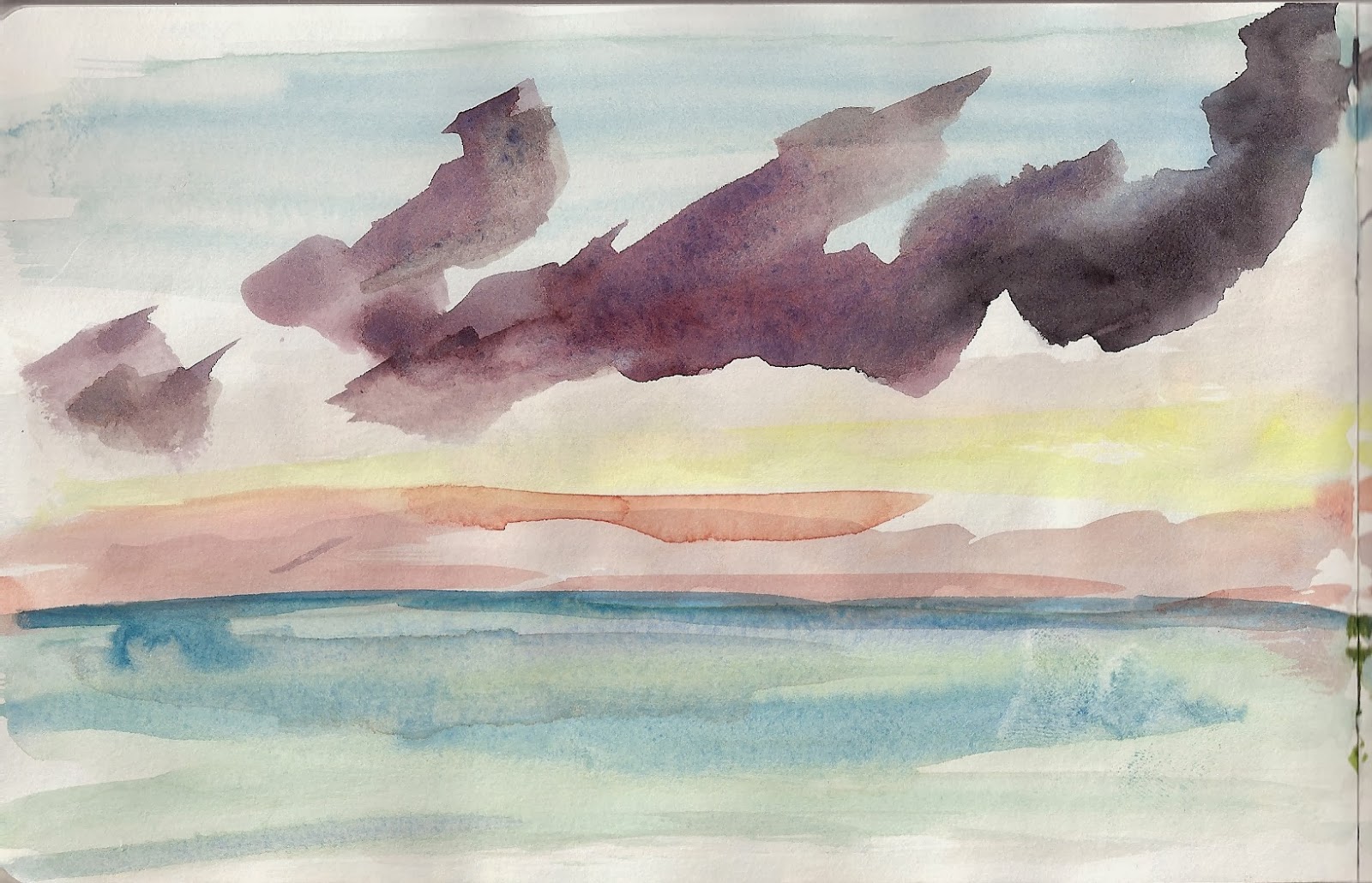
Like last year, the first night in the Keys I did a painting from the lanai.  This is the view looking south, where as last year it was looking north.  There were some really cool  and unusual, almost vertical clouds, that hovered in front of the sun.  

I was using a wet-in-wet technique (and I still have some trouble controlling my water). I used a little too much water on the right panel and the you can see how the color granulates (formation of pigment granules; see below).  However,  I liked how the colors ultimately flowed into each other and feel I captured the essence of that moment at sunset.

                                       The First Sunset
                               watercolor on paper 5.5 x 16.50

And here is a more detailed look at each panel:


     (Notice the how the orange and red in the sky begins to granulate as the color bleeds into the water)

Friday, January 10, 2014

The Flora and Fauna of Key West -- Part I

I took the opportunity to paint just about everyday while I was in Key West.  And this time, I did not just do landscapes, but decided to capture some of the available wildlife.

There were several iguana where we were stay and this guy was by far the biggest.  Most iguana avoid tourist, but not him.  I guess he felt he* felt he was the baddest iguana of them all, which was cool with me since it meant he did not mind posing.  I really enjoyed drawing him.

                                             Iguana, chilling
                                   Watercolor on paper 5.5x8.25

Ibis are ubiquitous in Key West, especially anywhere someone is eating a sandwich (say an watercolor enthusiast).  I have often thought about sketching them, but they usually move around too much.  This year, I decided to see if I could capture the Ibis. These three Ibis (is it pronounced "eye-by"?) were dawdling about, making them good candidates for sketching.  At one point they came to investigate but were either unimpressed or realized I had no food, so they moved on. 

                                         3 Ibis
                                   Watercolor on paper 5.5x8.25


*I assumed it was a male.  I did not ask and he did not tell.


Wednesday, January 08, 2014

Idling Away in a Sail Boat

My first post in 2014 is actually a painting from New Year's Day, sitting on a swing looking out to the Atlantic Ocean.  Amidst the jet skiers and cruise ships plying their way around Key West, there were several sail boats, just idling their way in the winter sun.  This one in particular caught my interest as it seemed to merely be content to just be idling away the day on the water.  I thought this was a nice sentiment on the first day of the year.

Using a "wet on wet" outside on a windy day is a bit tricky as the paper; the water wants to evaporate and dry so it is very easy to over saturate the paper to compensate (I did that in another painting I will post this weekend).  That said, I am happy with the sky and I especially like the layers of color in the water.


                                       Watercolor on paper 9x7

Thursday, December 26, 2013

Idyllic

This will most likely be my last studio piece of 2013, and for the first time in a long time, I feel I am making progress and showing growth.  The sky turned out how I wanted.  The mountains, for the most part, as well.  I was able to layer colors down (successfully), one on top of the other, to give this painting a more complex  look and feel.


                        Watercolor on 140lbs watercolor block 9x12


Sunday, December 22, 2013

A Sleigh Ride Together with You

It is a bit muddy in parts, but I finally achieved that "atmospheric" look I have been attempting to do.  Still need to work on a consistent and cohesive composition, but I like this quite a bit.

                            Watercolor on 140lbs watercolor block 9x12

Saturday, December 21, 2013

The Long View

Another day, another quick sketch.  These sketches are good exercise for my brain; they help overcome the inertia of the blank page.  I can envision a day in the future that I carry this little book with me and do sketches as I wait for a lunch meeting to arrive, just needed 5 minutes to capture the world around me.

In this picture, I particularly like the how the water spots creating tiny points of interest.  I still need to use more paint but I am getting better.

                                   Watercolor and ink on paper 5.5x5.5

It is good to see the Pocket Palette getting so much use.  This picture shows to me that I do not organizing my mixing palette by warm/cool like most real artist do but randomly where ever there is available space.  I will need to add paint to the pans before I head out on vacation.


Friday, December 20, 2013

Does your cat play guitar?

End of year is always crazy and leaves very little time for painting or sketching.  But I have decided not to let that stop me.  I am trying to do a small sketch a day in my little moleskin travel watercolor book (look back tonight or tomorrow for the next one).  

This is a quick, rough sketch done without a pencil under drawing, so directly with my Faber-Castell XS pitt pen.  The goal was to work fast and I like the energy of this piece. I used a photo reference from an Entertainment Weekly article on the new movie Inside Llewyn Davis.  Either Llewyn or the cat plays folk guitar, not sure which.

                                  Watercolor and ink on paper 5.5x5.5

Thursday, December 05, 2013

Final Hike of the Year -- Washington Valley Park

December is not going to be a very productive between end of year work, Christmas and (hopefully) vacation.  Even if I do get to paint on vacation, chances are I will not post them until January.  So, here is me beginning the month in earnest to keep the goal of four paintings per month.  

This tiny postcard was done on my final hike of the year in the various NJ parks I have recently rediscovered.  I had the overly ambitious idea of doing a series of postcards in the Fall but was only able to get this one done.  I am not completely satisfied with it, but it is a unique reminder of a great day.  As I continue on this journey of painting, I feel these little watercolors provide more vivid memories than digital photos ever could.


                             Pastel over Watercolor on 140lbs postcard paper 6x4


Wednesday, November 27, 2013

Yet Another Autumn Tree -- In Pastel and Watercolor

It might not seem it from this blog recently, but pastels are my favorite medium.  Sometime ago they surpassed even simple pencil or pen and ink as the medium I love most.  The portability of watercolors have allowed me to paint where ever I go, and as such, I have become much more prolific this year.  That said, I am still stumbling my way thru the medium, with as many wrong turns as successes.  And as I stated in last weeks painting, I want to do more pastels and watercolors.  I just need to continue to be bold.

                              Watercolor and Pastels on 140lbs watercolor block 12x16

Here is the same painting with just the watercolor underpainting. As you can see, it is substantially different from the final painting.  It is not a bad effort, but I felt it was missing something. So I added a robust foliage in bright red and orange pastels. It is debatable whether I improved it, but I did enjoy the process.

                                 Watercolor on 140lbs watercolor block 12x16

Wednesday, November 13, 2013

Transitions

One of my biggest goals regarding my art is to be able to incorporate both watercolor and pastels into a single unified look.  Previous attempts have been equivocal, mostly because I would not completely commit to the process or I would decide, "Hey, that watercolor is fine the way it is" and not add pastels.  But this time, I decided to be bold and, as the corporate jingle goes, just do it.   I like these results much better.

                            Watercolor and Pastels on 140lbs watercolor paper 9x12

Below is the watercolor without pastels laid over the top.  Like many of my watercolors, it lacked any compelling contrast; everything is a mid tone.  The addition of the pastels added more interest; darker clouds and bolder mountains. 

Friday, November 08, 2013

The Never Ending Flight Back from Berlin

Anyone who travels for business knows, if you travel often enough, you will eventually have that flight.  We have all experienced it, the one where everything goes wrong and there is this sort of harmonic divergence.  Well, yesterday, flying back from Berlin, it happened.  What should have been a direct flight of 6-7 hour flight took 14 hrs, with a layover in Gander, Newfoundland.

Fourteen hours is a lot of time to be sitting in one place and there are only so many movies that I can watch at a given time. And since my new travel pack is so compact, I decided to do a painting.  I have seen similar paintings on Urban Sketchers and have always wanted to do one.  This trip provided the perfect opportunity.

                                    watercolor on paper 5.5 x 16.50

And here are close ups of each page (click to embiggin'):


Monday, November 04, 2013

St Patrick's San Francisco

Work travel does not, as a rule, allow for much time for sketching.  So this time I had to improvise and make a quick sketch from my hotel room.  I had a nice view of St Patrick's on Mission St, which is currently undergoing renovations.

                                  Watercolor on paper 5.5x8.25 plus a bit more


Here is the actual view with the painting for comparison.